Good News! We've launched an all new Chat Resource Center.
The SDK or APIs in this tutorial may be out of date. We recommend checking out our new Chat Resource Center, which includes overviews, tutorials, and design patterns for building and deploying mobile and web chat.
We've published a wide variety of demos and tutorials showing you how to build a real-time chatroom with JavaScript; 10Chat with only 10 lines of JavaScript, AngularJS chat, going “native” with PhoneGap for Android and iOS, etc.
And this time, I am showing how to create yet another chat app with Material Design using Polymer to create a simple but visually appealing app with a great user-experience.
The live demo, called Kitteh Anonymous, can be seen here. Open up two browsers and watch as your messages are sent and received in real time. In this tutorial, you'll be writing the lite version of this demo.
Notes: This article was written prior to Polymer 1.0 launch, and the code used in this tutorial is no longer compatible with the latest Polymer. To be able to work with this tutorial, you need to use Polymer 0.5.x, and PubNub Polymer component, pubnub-element 3.6.7. See this bower.json for the specific versions!
Prerequisites
- Basic knowledge of Polymer
- Basic understanding of Bower package management tools, to download, install, and manage dependencies of Polymer component files, is highly recommended, but not necessary.
Polymer and The Web Standards
You may think Polymer is just an another JavaScript UI library. However, where is differs is that Polymer is built on top of a set of new W3C web platform primitives called Web Components. The W3C APIs included under the Web Components family are:
- Shadow DOM
- Custom Elements
- HTML Imports
- HTML Templates
and Polymer's webcomponents.js works as the polyfills for the new features, as well as W3C DOM4, DOM mutation observers and ECMAScript standards, Object.observe().

Building Web = Playing with Lego Bricks
Polymer web components are encapsulated and reusable components that can be mixed and matched with other components (like you're playing with lego bricks!). You can use pre-made components and you can create custom components.
When you build web apps with Polymer, you first import elements you need, then use the elements.
Material Design and Polymer
Material Design is a design specification for visual and interaction design that adapts across different screen sizes and devices. Initially, the design was created for Android 5.0 Lollipop, however, Material Design has been extended to web later when Polymer has introduced Paper Elements.
1. Creating Your Material Design App with Paper Elements
Let's get started. First, you need to install Polymer and import all the components you need to build your app.
1.1. Install Polymer
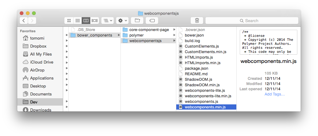
First, you need to install Polymer's core files in your project directory. The recommended way is using Bower to install them locally, rather than using the code hosted on CDN. To learn more about the installation process, read the official documentation.
$ bower install --save Polymer/polymer#^0.5
This will give you the basic files for you to get started.

In the <head> section of your index.html, include only webcomponents.min.js.
1.2. Import UI Components
The demo app UI is structured with several Polymer Core and Paper elements, also, one custom element.
- core-scaffold (which includes header, toolbar, menu etc, and provides a responsive layout for your app)
- core-item
- paper-input
- paper-fab
- custom (You will create this later)
Install the 4 components with Bower.
$ bower install Polymer/core-scaffold#^0.5
$ bower install Polymer/core-item#^0.5
$ bower install Polymer/paper-input#^0.5
$ bower install Polymer/paper-fab#^0.5
Once installed, use HTML imports to load components. In the head of your HTML, after you included the script (at step 1.1.) import the elements:
This ensures that your elements and all dependencies are loaded before you use them.
1.3. Building the Basic App UI Structure
First, use <core-scaffold> to create the basic layout. This element comes with sub-components, <core-header-panel>, <core-toolbar>, and <core-drawer-panel>, and lets you scaffold the responsive layout quickly.
This will create a core structure of the app. Although <core-scaffold> lets you build an easier and simpler structure, I am altering the default layout by giving a tall header for the drawer panel (which just looks like a left column, if you are viewing on a large screen) at the left.
Notice the attributes used in <body>. The fullbreed attributes are used to make the body to fill the viewport, and unresolved is used to avoid to display flash of unstyled content (FOUC).
Also, you see flex attribute in some elements. They expose CSS Flexbox as attributes, and the child-element under layout horizontal | vertical with flex attribute takes up the available space either horizontally or vertically.

1.4. Using Individual UI Elements
Inside the basic app structure, use the imported components in where you want to use them. For example, the code below will display a nicely styled input that stretched to take the entire space, along with a button with a “send” icon.
Also, please take a look at the simplified demo, lite.html in GitHub repo to see how all imported components are used.
Notice the attributes with values in curly brackets like, {{input}} above. They are expressions and event handlers (on-*). The next step briefly explains the data binding in polymer.
1.5. Data Binding
Polymer has declarative, two-way data binding using the new HTML standard, <templates> element. To enable the feature, let's wrap the entire app with auto-binding <template>:
Once the app is wrapped, for example, you can access the user input value data, {{input}} in the <paper-input>, seen at the previous step (Section 1.4) as following:
Also, you can simplify your markup for repeated elements by using a data model. Let's create a list with <core-item> inside of the drawer panel.
In JavaScript, define the items array. (I am using the predefined icons for <core-icons>.)
This screenshot shows the repeated list items using the <core-item>.

2. Creating a Custom Element
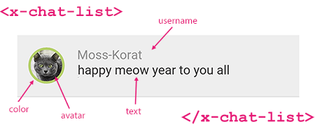
In the main area, we are going to display a list of chat conversations. Each chat convo UI consists of a user avatar, user ID, and chat text. Since either Core or Paper elements come with such Lego bricks, let's make one!
Create a new HTML file, let's call it x-chat-list.html.
This custom element, <x-chat-list> takes attributes, avatar, color, username, and text.

Here, I am not showing a step-by-step instruction on exactly how to create a custom element using Polymer, however, the simplified code is the following:
CSS is not included in the snippet above, but you actually do need to style as needed. View the entire x-chat-list.html on GitHub repo.
and in your index.html file, import the custom element, and use it in the main content area.
PubNub will handle the sending and receiving of messages in real time, and we'll implement in the next step.
To learn more about creating your own element, read the Polymer documentation.
3. Using PubNub Element to Send and Receive Chat Messages
Now you are going to use PubNub's Polymer element, <pubnub-element> to create a chat room. Unlike other elements we have used so far, the <pubnub-element> does not contain any user-interface, however, it contains all the functionality that allows you to publish and subscribe data stream in real time.
This requires your own API keys, so you need to sign up for a PubNub account to get your unique PubNub keys. Your publish/subscribe keys are in the Developer's Admin Dashboard.
3.1. Install and Import <pubnub-element>
Install with Bower, just like any other components:
$ bower install --save pubnub-element#3.6.7
In your index.html import the element:
3.2. Use PubNub Element: Initialize
Then initialize the PubNub client using <core-pubnub> element.
The uuid is a unique identifier of an each user, and will be a randomized string. In this demo, a UUID with the combination of color and cat, such as maroon-tabby, is given when a new user access the web app.
3.3. Sending a Message
<core-pubnub-publish> element is used to send messages to all subscribers of a channel.
Let's send a message when a user type something and tap the button (<paper-fab>). Polymer uses on-* event handlers. Using on-tap event in <paper-fab> can trigger the action.
3.4. Binding and Displaying Real-time Data Stream
Now, use <core-pubnub-subscribe> element to receive the messages that have sent to the network.
The messages attribute contains an array of all messages received. Let's display the newly received data into the x-chat-list custom element that you have created. Actually, in the earlier step (Section 2), you already binded the array, messages, so each datum should be displayed automatically!
The messages="{{messages}}" attribute adds a two-way data binding between this element and the <x-chat-list> element.
Let's take a look at the <x-chat-list> block again:
The on-callback callback event fires when a message is retrieved.
The array contains messages in chronological order, and the newest message is at the very bottom of the list. At the callback, let's scroll the list UI to the bottom so the latest chat message is always visible.
Congrats, you just finished writing a simple Polymer chat app with Material Design!
I didn't cover all other features shown in the full demo (PubNub Storage & Playback API to display older chat messages, online status with the Presence API, CSS styling Shadow DOM, etc.), however, you can always peek the source code in the GitHub repo!
Packaging your App with PhoneGap
If you would like to convert this app into “native” apps for Android and iOS, I have written a few PhoneGap/Cordova tutorials before!
- Converting Your JavaScript App to an Android App w/ PhoneGap
- Converting Your JavaScript App to an iOS App w/ PhoneGap

