Creating Real-time Charts and Graphs with Microsoft Power BI
Real-time charts and graphs take business intelligence to a new level, and PubNub is excited to make your Realtime Data Visualization available on the Microsoft Power BI platform. In most any industry use case (Automotive, Energy, Manufacturing, Medical, Retail, Smart City, Telecommunications, etc.), you can use PubNub to feed your real-time data into Microsoft Power BI.
In this tutorial, we’ll document how to feed your PubNub data streams into Power BI, resulting in some really impressive real-time charting functionality!
How to create Power BI dashboards
We’ll use “demo” API keys to get off the ground quickly, but if you wish to use your own PubNub data or if you don’t yet have an account, go ahead and sign up now. Create an App, and then a Keyset, and you’ll be ready to go.
Creating Microsoft Power BI Dashboards
To get access to Power BI:
- Browse to https://powerbi.microsoft.com/en-us/ to be taken to the Power BI homepage.
- Click Get started free.
- Click Sign Up under Power BI (Not Power BI Desktop for Windows).
How to create real-time charts in Power BI
Power BI can chart any PubNub real-time data stream, as long as the payload is a JSON object. In addition, PowerBI supports not only flat objects, but also those with hierarchy (objects within objects). Neat, huh?
In reality, you can use your very own PubNub data streams to populate Power BI charts, but for the sake of simplicity, we’ll use a demo datastream called “sensor-network.”
Our Sample Demo Datastream for Power BI dashboards
Our “sensor-network” datastream object contains real-time environmental data from five different cities, with attributes of:
- Location / Geo (keyed by name, with lat/lon object data)
- Temperature (in both F and C)
- Humidity (%)
- Barometric Pressure (mb)
- Pollution Index
- UV Index
- Noise Level (dB)
In JSON, the native format PubNub communicates in, it will look similar to this snippet:
{
    "timestamp": "2016-08-23T22:31:40.255Z",
    "Novato": {
        "geo": "38.1074° N, 122.5697° W",
        "temperature": {
            "F": "99.9",
            "C": "37.7"
        },
        "humidity": "40.965",
        "barometric": "1011.8",
        "pollution": 3,
        "uv": 9.5,
        "noise": "28.75962"
    },
    "Redmond": {
        "geo": "47.6740° N, 122.1215° W",
       ...
    }
}
Now that you have an overview of what our sample data looks like, the next step is to create data visualizations.
Creating our first Power BI Dashboard, PubNub Data Source, and Chart can be done quickly and nearly simultaneously. Let's jump right in and begin by defining a new Dashboard!
Defining a New Dashboard in Power BI
If you’ve already setup Power BI in the past, then when you login, go ahead and skip to the Previously Setup Account section below.
If this is your first time logging in to Power BI, follow the Newly Setup Account instructions below.
How to use a newly setup Power BI chart to create a dashboard
When you first login to Power BI, you will be presented with the Welcome screen.
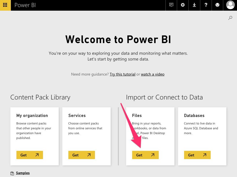
- Click Get under Files.
The Files menu appears.
- Click < My Workspace to return to the Workspace screen.
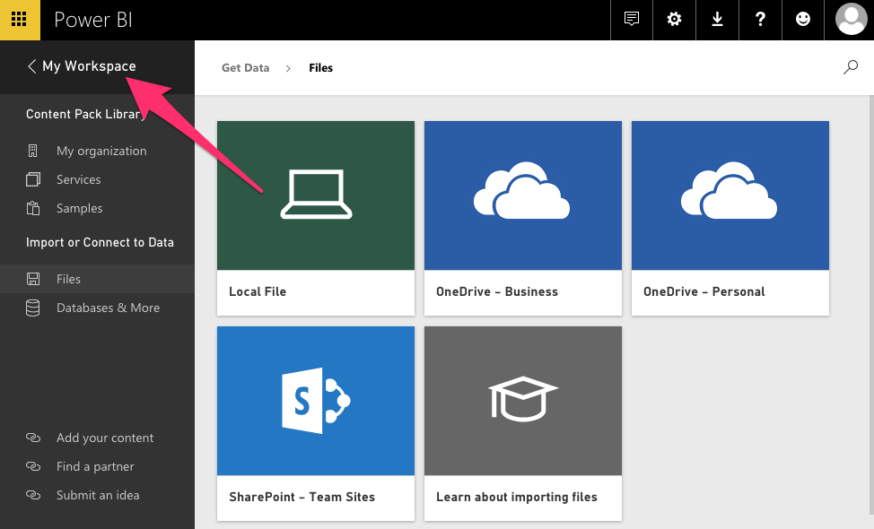
Proceed to the Previously Setup Account section below to continue.
How to use a previously setup Power BI chart to create a dashboard
- Expand the Power BI left menu by clicking the three horizontal lines on the collapsed menu bar.

Once expanded, the left menu should look similar to this:
NOTE: If this your first time using Power BI, the three horizontal lines may not be visible. If this is the case, instead, click Sample Data.
- Click on the + (plus-sign) under Dashboards.
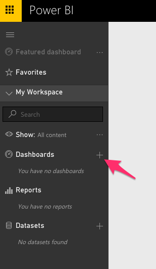
A text field will appear.
- Enter PubNub Sensor Cluster in the text field, then press the enter key.
- Click on the newly created PubNub Sensor Cluster.
You’ll now be viewing the empty PubNub Sensor Cluster Dashboard.
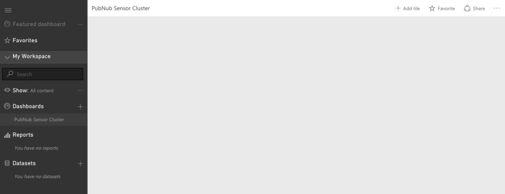
Next, lets add a Tile to the Dashboard.
- Click the + next to Add Tile (located in the upper left of the screen).
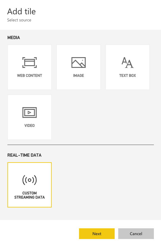
The Add tile panel appears.
- Click the CUSTOM STREAMING DATA button, located below the REAL-TIME DATA heading, then click Next.
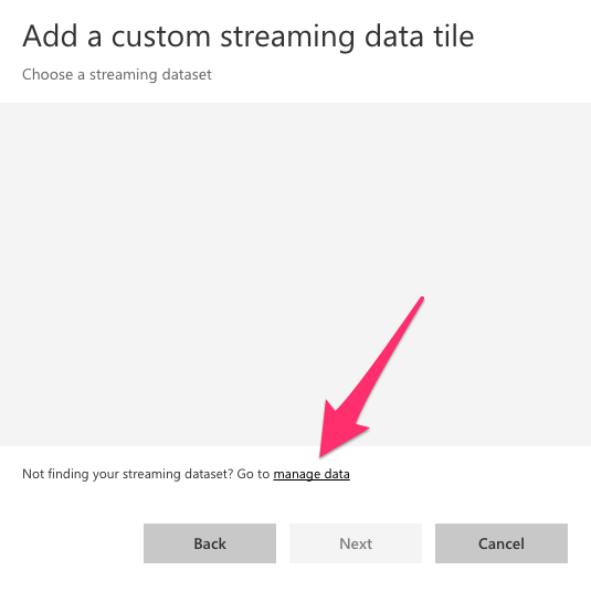
The Add a custom streaming data tile panel appears. This screen is where we will bring in the actual PubNub Data Stream, credentials and all, into Power BI, as a streaming dataset.
Add PubNub as a Streaming Dataset for Your BI Dashboard
To add PubNub as a streaming dataset for your Power BI dashboard, click manage data.
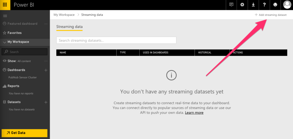
The Streaming data page opens.
- Click the + Add streaming dataset link in the upper-right of the screen.
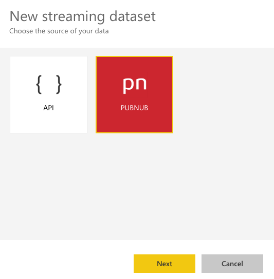
The New streaming dataset panel opens.
- Select PubNub, then click Next.
- For Dataset name, enter PubNub Sensor Network.
- For Sub-key, enter the PubNub subscribe key for this tutorial, mspowerbi.
- For Channel name, enter the PubNub data streams channel for this tutorial, sensor-network.
- For Access Manager Auth Key, leave it blank, as this demo dataset does not utilize one.
- Click Next.
Upon clicking Next, you should see an example schema and example object representation of the data.
NOTE: This dataset is large — be sure to scroll all the way down to get a comprehensive look at the information presented.
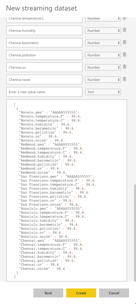
- Click the Create button to save this newly created Streaming dataset.
The Streaming Data page appears again, but this time, with our PubNub Sensor Network displayed as a defined entry.
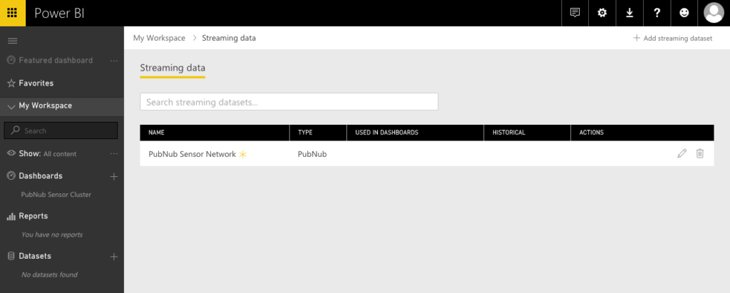
Now that we’ve created the streaming dataset, we have the foundation to build our visualizations on top of it.
How to create charts in Power BI dashboards
Power BI provides many different chart types for real-time streaming data. They include:
- Cards
- Line Charts
- Clustered Bar Charts
- Clustered Column Charts
- Gauges
Each chart type has its niche — more details on the various chart types can be found within Power BI documentation, but I’ve assembled a brief summary of when to use each one.
Using Cards for your Power BI dashboard
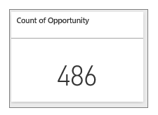
When the latest number value of a metric is the most important thing to know, use a card.
Using Line Charts for your Power BI visualization
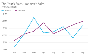
Line charts display data points, connected together by lines. A great use of line charts is to visualize data changes across a time period.
Clustered Bar and Column Charts for Power BI dashboards
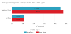
Column charts display data relative to a horizontal (x-axis) reference point, and bar charts display data relative to a vertical (y-axis) reference point. Both are great for displaying changing minx and maxes. “Clustered” just means that you can display many values together (for example, “North American Sales” and “Asia Sales”) together on the same tile.
Gauges for BI dashboard visualization
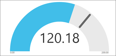
A gauge chart shows a min and max of two extremes, and where your value lies between the two. These are best used when it's important to know where you stand in the midst of two extremes.
NOTE: Although Power BI provides a wide-range of industry-leading visualization features, the purpose of this post isn’t to go in-depth into all of them at once. Instead, we’ll begin with simple PubNub-driven examples, and based on user feedback, we will be excited to add more blog post installments with more varying, user-requested topics. As such, as you have fun learning about PubNub visualizations through Power BI, take some notes on additional areas of interest, and email them to use at support@pubnub.com.
Now that we know our options, let's begin with a simple Card example.
Creating a Card
- Under Dashboards click PubNub Sensor Cluster.
- Click + Add tile, located in the upper left of the screen.
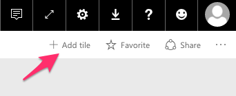
The Add tile panel appears.
- Click the CUSTOM STREAMING DATA button, located below the REAL-TIME DATA heading, then click Next.

- Click the PubNub Sensor Network button, then click Next.
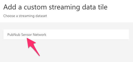
The Visualization Type dropdown will appear.
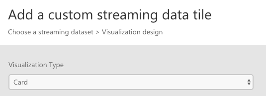
- Select Card.
- Under Fields, click + Add Value.
A dropdown will appear with attributes of the PubNub data stream.
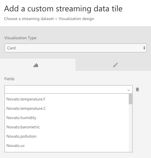
- Scroll down to select Chennai.noise, then click Next.
- In the Title field, enter Noise in Chennai.
- In the Subtitle field, enter dB.
Your screen should look similar to below:
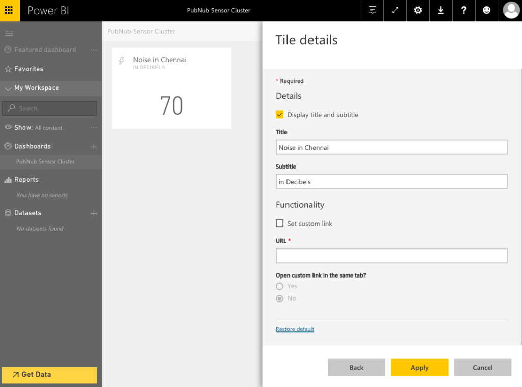
- Click Apply.
- Repeat the above steps, but with noise readings from Novato, Redmond, and San Francisco.

Congrats! You’ve created your first real-time visualizations with Power BI Cards powered by a PubNub data stream!
Next, we’ll experiment with Line Charts.
How to Create a Line Chart in Power BI
- Click + Add tile, located in the upper left of the screen.
- Click the CUSTOM STREAMING DATA button, located below the REAL-TIME DATA heading, then click Next.
- Click the PubNub Sensor Network button, then click Next.
The Visualization Type dropdown will appear.
- Select Line Chart.
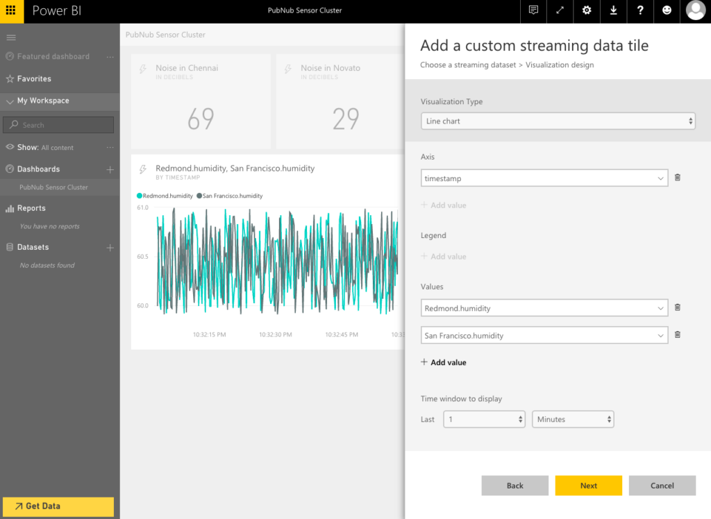
- For Axis, click + Add Value, and select timestamp.
- For Values, select Redmond.humidity.
You should now see the humidity in Redmond as a function of time in the preview. But for bonus points, let's also plot the humidity in San Francisco as well.
- For Values, select San Francisco.humidity.
Your screen should similar to the example below:
- Click Next.
- For Title, enter Redmond vs San Francisco.
- For Subtitle, enter By Percent Humidity.
- Click Apply.
The line chart appears next to the last card we made. Let's resize and arrange our new line chart for purely aesthetic purposes.
- Drag the line chart to place it below the cards.
- Resize the line chart by grabbing it by the lower-right corner, so it's flush with the right-hand edge of the right-most card.
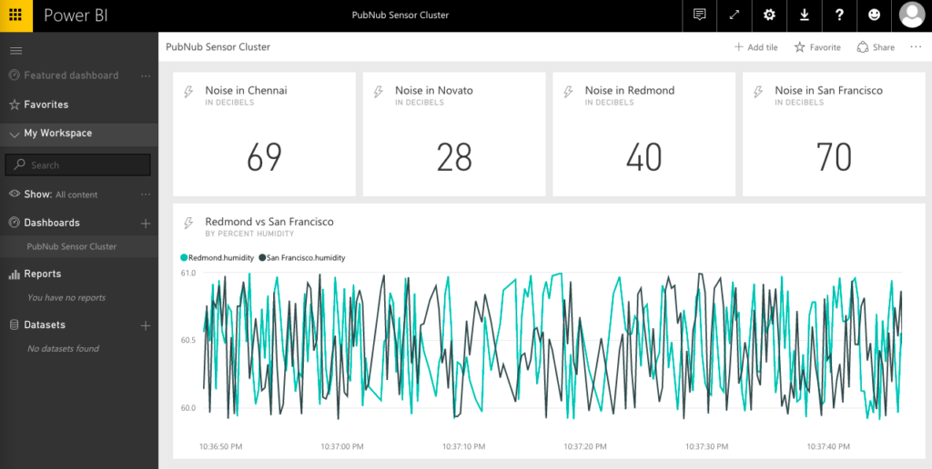
Congratulations are in order once again, as now, we have a two value Line Chart added to our Dashboard!
Next, let's create some Bar and Column charts.
Creating Bar and Column Charts in Power BI
- Click + Add tile, located in the upper left of the screen.
- Click the CUSTOM STREAMING DATA button, located below the REAL-TIME DATA heading, then click Next.
- Click the PubNub Sensor Network button, then click Next.
The Visualization Type dropdown will appear.
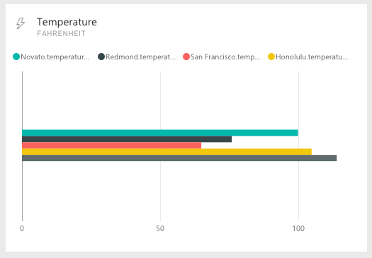
- Select Clustered Bar Chart.
- For Value, add Novato.Temperature.F.
Repeat the above step for each other city’s temperature in Fahrenheit.
- Click Next.
- For Title, enter Temperature.
- For Subtitle, enter Fahrenheit.
- Click Apply.
We now have the a temperature bar chart. Next, let's do a variation of the same data, but in a column chart.
- Click + Add tile, located in the upper left of the screen.
- Click the CUSTOM STREAMING DATA button, located below the REAL-TIME DATA heading, then click Next.
- Click the PubNub Sensor Network button, then click Next.
The Visualization Type dropdown will appear.
- Select Clustered Column Chart.
- For Value, add Novato.Temperature.C.
Repeat the above step for each other city’s temperature in Celsius.
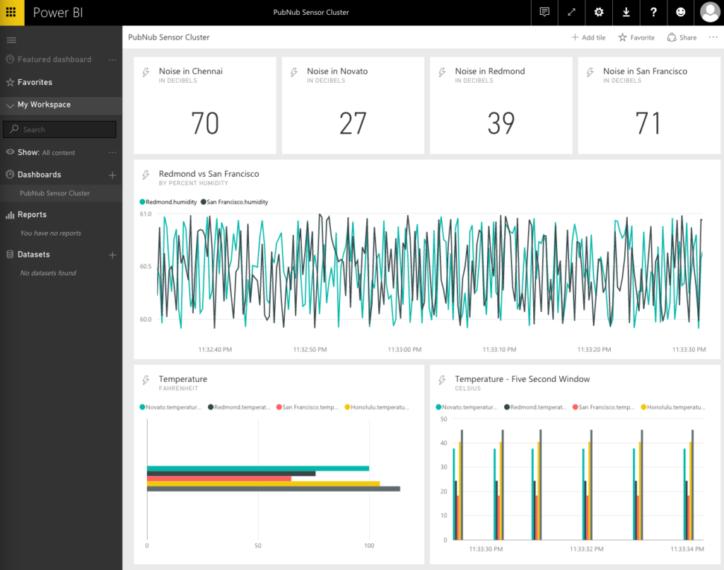
In the column chart example, we omitted the x-axis (known simply as the axis). By adding an axis value (in this case, the timestamp), we can then show multiple instances of the chart relative to the axis value, within a time window.
- Under Axis, click + Add value.
The Axis dropdown will appear.
- Select timestamp from the dropdown.
- Under Time window to display, enter Last 5 Seconds.
- Click Next.
- For Title, enter Temperature – Five Second Window.
- For Subtitle, enter Celsius.
- Click Apply.
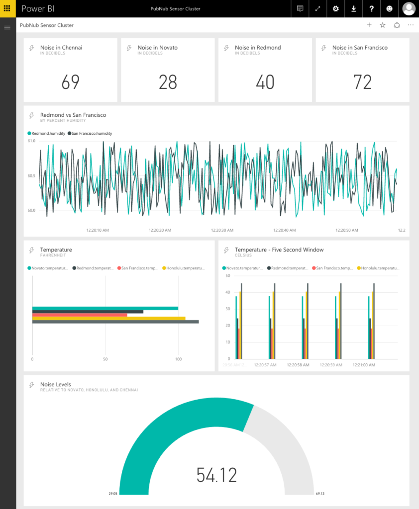
We now have two versions of the same data visualized very differently. Two units of measure are shown in two charting formats, one, with the bar chart’s values displayed in-place for an always current view of the data, and the other as a column chart, the last five seconds worth displayed.
For our final chart, lets create a gauge chart to compare the noise levels of three cities at once.
Creating Gauge Charts in Your Dashboard
- Click + Add tile, located in the upper left of the screen.
- Click the CUSTOM STREAMING DATA button, located below the REAL-TIME DATA heading, then click Next.
- Click the PubNub Sensor Network button, then click Next.
The Visualization Type dropdown will appear.
- Select Gauge.
- For Value, select Honolulu.noise.
This will make it so the gauge indicates the noise in Honolulu.
- For Minimum Value, select Novato.noise.
This will re-scale the gauge at the min-point, so the min value in the scale represents the current noise level in Novato.
- For Maximum Value, select Chennai.noise.
This will re-scale the gauge at the max-point, so the max value in the scale represents the current noise level in Chennai.
- Click Next.
- For Title, enter Noise Levels.
- For Subtitle, enter Relative to Novato, Honolulu, and Chennai.
The gauge appears next to the last chart we made. Let's resize and arrange our gauge for purely aesthetic purposes.
- Drag the gauge to place it below the column and bar charts.
- Resize the gauge by grabbing it by the lower-right corner, so it's flush with the right-hand edge of the right-most column chart.
And there you have it, a crash-course in using PubNub real-time data streams with Power BI!
We hope you enjoyed this tutorial! Your feedback is really important — tell us what you’d like to see us focus on for our next installment of Power BI and PubNub blog posts. Email your requests to support@pubnub.com, and we’ll be looking forward to your feedback!
