In my previous post, we walked through an example of hardware-to-hardware communication to trigger an LED using a button.
In this post, we'll walk through a hardware-to-software design pattern. This application will have a sensor on one end (in this case, measuring air pressure), and we'll stream the readings to a real-time, live-updating dashboard (in this case, a spline chart).
There are two parts of this app:
- Server side: runs on the microcontroller and collects and streams the data to the client side.
- Client side: receives the readings in real time and displays them on the chart (using the EON framework for real-time dashboards and charts).
The full code is available here.
Check it out in the video below, and after that, we'll get coding!
Flow Diagrams
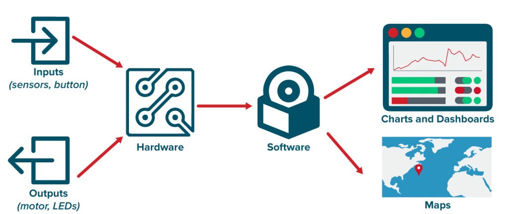
The diagram below shows the general design pattern for a hardware-to-software communication app.

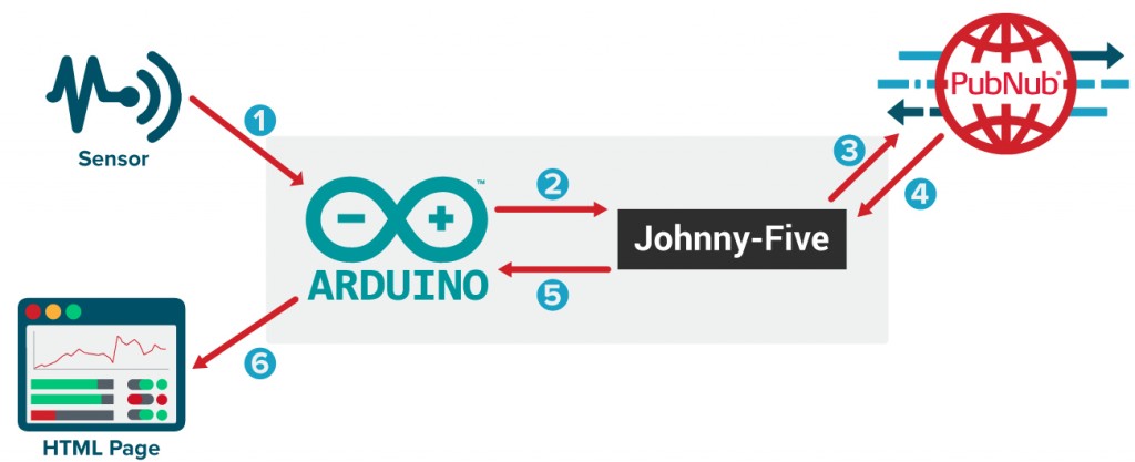
This diagram shows the design pattern for our application we're building in this tutorial.

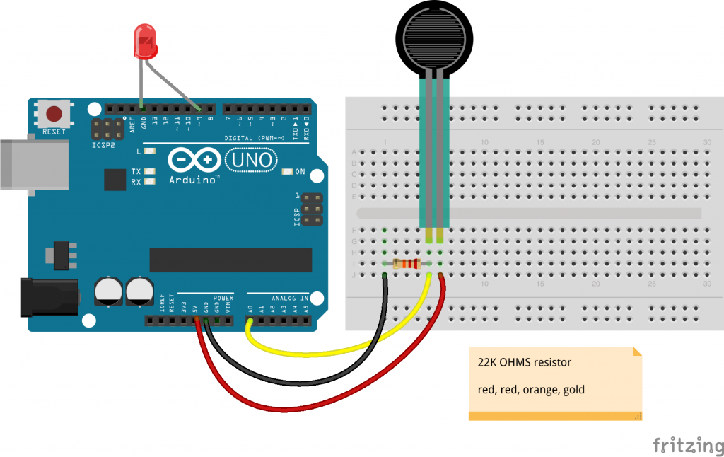
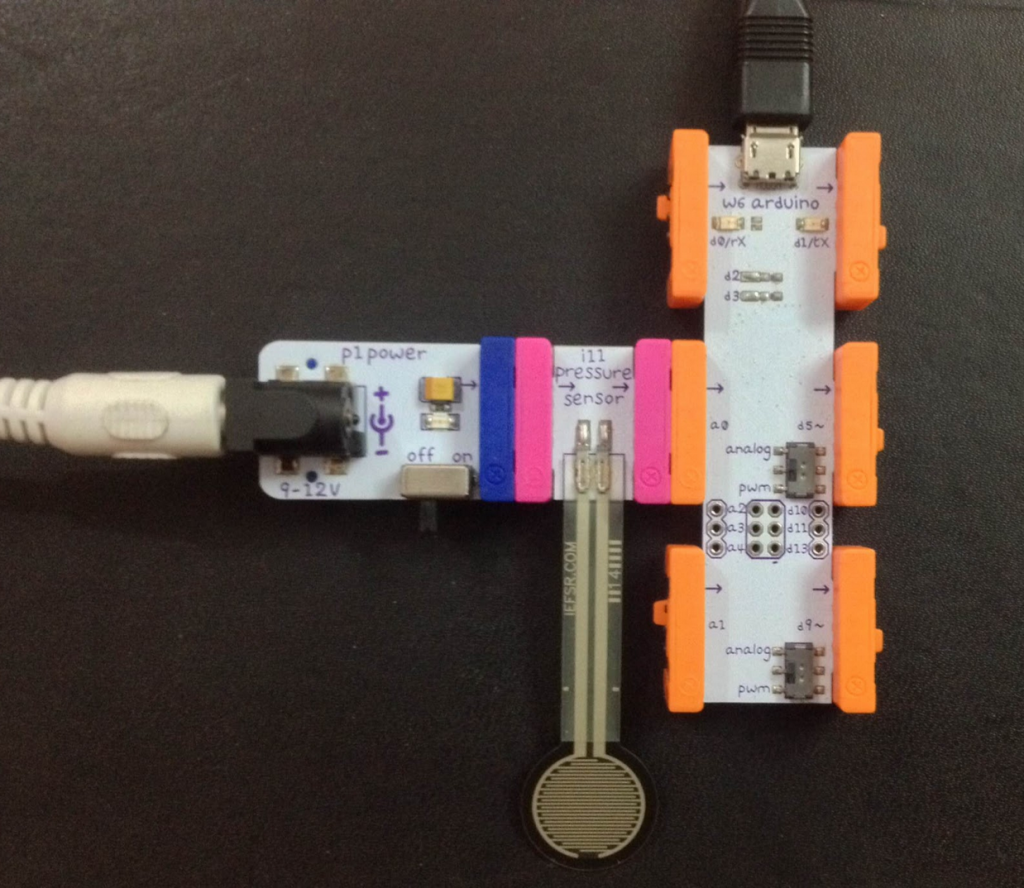
Circuit Diagrams


Part One: Server Side
First, create a JavaScript file app.js. Then, install the npm packages.
npm install pubnub -g
npm install johnny-five -g
These two packages will be installed globally. Inside the JavaScript file, first mention the packages required and the variables needed.
Here, we have required both the Johnny-Five and PubNub packages. In the pubnub variable, input your unique publish and subscribe keys.
To get your unique publish/subscribe keys, you’ll first need to sign up for a PubNub account. Once you sign up, you can get your unique PubNub keys in the PubNub Developer Dashboard. Our free Sandbox tier should give you all the bandwidth you need to build and test your app with the PubNub API.
Then initiate the board:
Here, ‘five’ has a board module, inside which we are setting up the sensor on pin ‘A0’ which will get the readings every 100ms. Read more about board component's initialization and usage here, as well as the Johnny-Five sensors’ APIs here.
Once everything is set up, we can start sending and receiving the events (ie. the sensor readings).
Here, we have first set the scale of readings that we get from sensor as the range of 0 to 10. Whenever it receives the data, we convert it into two digit decimals, and then we publish that reading to ‘pubnub-eon-iot’ channel.
Inside the message, we have columns array. Inside the columns array, we have two more arrays. The first array refers to X-axis of spline chart.
The first element in the array is what we want to call to the X-axis. We are just calling it ‘x’ for now and second element represents what data are passing to it. We are passing the current time and hence we are creating a time-based chart.
Second array inside columns represents Y-axis.
First element refers to what do we want to call to Y-axis. We are calling it ‘Pressure Sensor’. We can may be add any unit to it after calibration. And second element is the data we are getting from the sensor and passing to channel.
With that, the server side is ready! Here's is the full code:
Part Two: Client Side
Any number of client side frameworks (Ember.js, Angular.js), web frameworks (Rails), or even middleware (Express.js) can be used, but for the sake of simplicity, we'll make one HTML file.
Here's how the HTML will look:
Inside a basic HTML5 template, we first added the JavaScript and CSS file for EON charts through CDN:
Next, add a div with id ‘spline’ inside body where we will add the chart.
Just after the body tag, we added the JavaScript tag which will receive the data from the PubNub channel and add it to HTML.
‘eon.chart’ returns a C3 chart object. We supplied the PubNub channel name to channel param. Inside ‘generate’ param, we mention where the chart will be coming in the bindto parameter as the id or class of the HTML tag where it will be put (i.e. #spline).
In the data object, we only have to specify two things : x and labels. x will bind to ‘x’ coming from columns in server side and y-axis will automatically binded to second parameter of columns of server side. So we just need to worry about if we want to show its labels (i.e. true or false).
In the axis object, we specify what type of chart are we making. Here, it is a ‘timeseries’ chart and the format of time is hour, minute and seconds. We set the flow as true so that the chart keeps flowing in real time as new sensor data is received.
To run this program, you have to push the Standard Firmata file from Arduino IDE to your board first and then run ‘node app.js’. Open the index.html in the browser.
Whoa! Now we can monitor all the sensors using JavaScript on a spline chart.